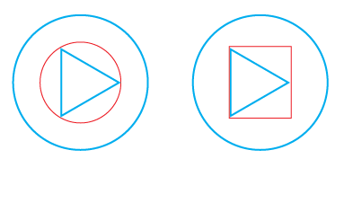
« Balance in Design Where Precision Meets Perception. » Alignment based on the area of elements versus the edges of elements
Attaining precise alignment is paramount among the fundamental design principles for crafting an optimal layout and enhancing the user experience of any graphical composition featuring multiple elements. »
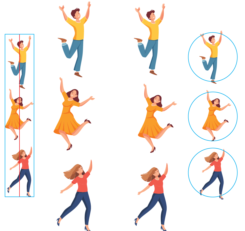
Area alignment in design involves aligning elements based on their visual weight or area, rather than just their edges. Unlike traditional edge alignment, which relies solely on the physical boundaries of elements, area alignment considers the perceived mass of each element within a composition.
For instance, when arranging icons on a sidebar with varying widths and heights, traditional edge alignment may create visual inconsistencies due to the differing shapes and sizes of the icons. However, by employing area alignment, designers can ensure that each icon carries a balanced visual presence within the composition. This technique enhances the overall harmony and aesthetic appeal of the design interface, contributing to a more cohesive and user-friendly experience
Alignment based on the area of elements versus the edges of elements.
Takeaways
Visual Balance: Choose area alignment for diverse elements based on their perceived mass for a harmonious layout.
Uniform Symmetry: Use edge alignment for simple, symmetrical objects to maintain a clean design.
Enhanced Readability: Hang pull quotes and align numbers/bullets with text edges to improve clarity, except when hierarchy requires a different approach.