Navigating the Paradox of Choice in Decision-Making
In decision-making, the paradox of choice is significant. « The Art of Choosing » explores human decision-making complexities, revealing how too many options can lead to paralysis.
Despite people’s tendency to favor numerous choices, research shows a desire for abundance, driven by a perceived sense of control.
However, excess choices don’t always yield better outcomes. The quest for control, intertwined with options, is innate but doesn’t always lead to success. The principle emerges: less is more.
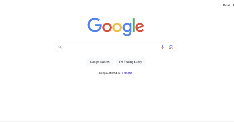
Amidst a sea of choices, simplicity guides users toward clarity.
Embracing « less is more » becomes not just a directive, but a philosophy for designers.

Simplicity Wins: Prioritize clarity over clutter, understanding that too many choices can overwhelm decision-making processes.
Usability Matters: Focus on user-friendly design, avoiding complexity that could confuse or frustrate users.
Balance Choices Wisely: Navigate the trade-off between flexibility and usability, aiming for a sweet spot that empowers users without overwhelming them.