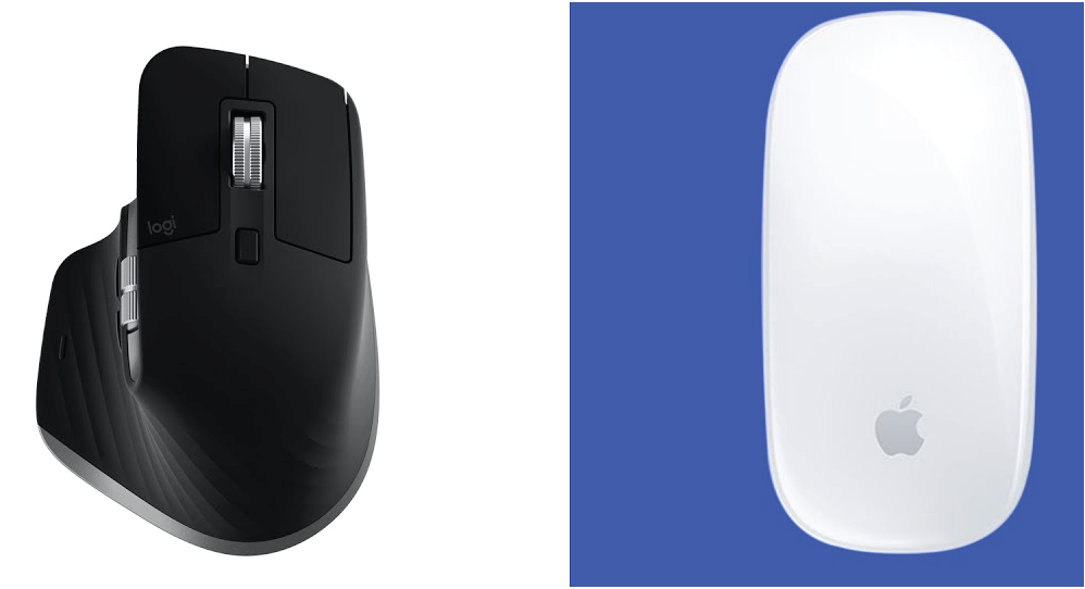
Optimal design does not always align with user preferences; what enhances performance may differ from what users find appealing.
Designers often confuse « the customer is always right » with « the user is always right, » which can be misleading. Performance and user preference don’t always align; for instance, while minimalist designs frequently enhance usability and performance by reducing cognitive load, many users prefer visually rich interfaces with more features and colors, as they perceive them to be more engaging and interesting. another example, is the Dvorak keyboard improves typing efficiency but remains unpopular compared to the familiar QWERTY. To balance performance and preference effectively, designers should observe users in real contexts rather than rely on surveys or preferences, as user feedback may not accurately reflect their interactions with a design
